NDepend: Graph

After viewing the dashboard, the next thing I took a look at is the Graph. This report gives an overview how the code is linked together. Either by projects or namespaces. In a smaller project, I immediately spotted something off. Let's delve a little deeper.
Just a small disclaimer if you didn't read the previous article: NDepend is sponsoring my blog with a one year subscription. My views are still my own, if I didn't like their product, I wouldn't be so positive about it.
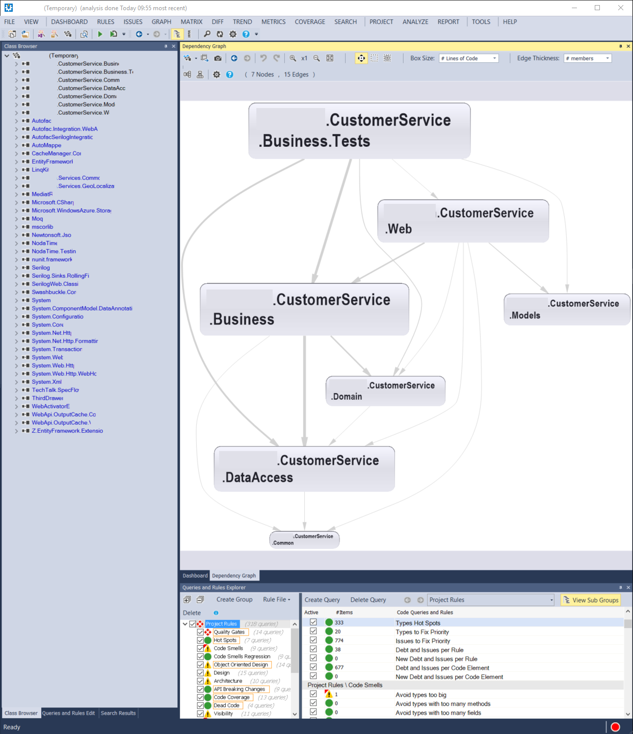
Smaller projects are more easily analysed in this report. So I opened a smaller, non-trivial project to check out what I could learn. The first thing I noticed was that this screen can get pretty busy, pretty fast. Then again, displaying the relationships between projects is no easy task, NDepend displays this information as succinctly as possible. It's also quite easy to filter out a lot of classes to investigate a certain area of the codebase.
After opening the project and just looking at the graph, the first thing that was immediately clear is that there are way too many arrows pointing to the DataAccess project. This indicates tight coupling and a lot of direct references. Upon further inspection, I discovered that the repository interfaces are located inside the DataAccess project. This means that there is no inversion of control.
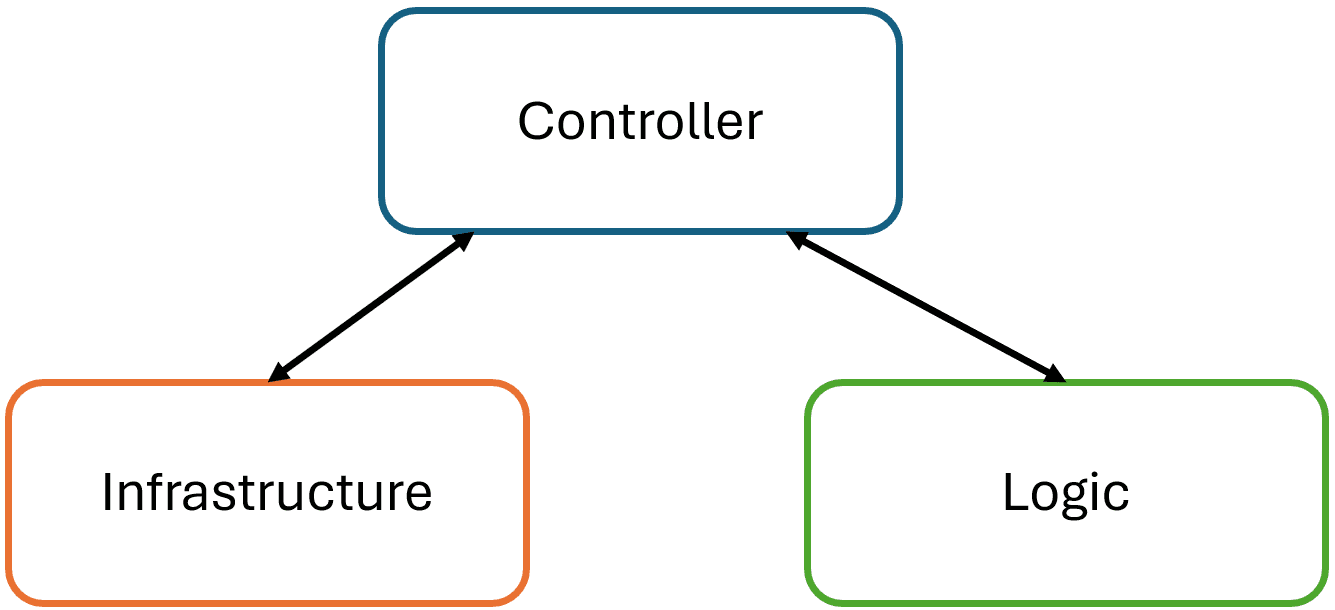
Let's imagine the perfect situation. There is a Business project that needs data, so it creates a repository interface that asks for certain data. The DataAccess project then implements that interface, fetches the data from SQL Server, Oracle database, Azure, CSV file, basically wherever it wants. When the Business needs different data or needs to pass different parameters, it can change the interface. So if the interface changes, the DataAccess would need to make the same changes. In this scenario, the Business project is in control of the repository interface.
Unfortunately, the graph indicates that this is not the ideal situation. The repository interface is located inside the DataAccess project. So every change the Business needs, it has to nicely ask the DataAccess to implement. Here, the DataAccess is in control. This also means that the Business project has to have a dependency on the DataAccess project for the interface, but not the implementation. Which will be passed to it via injection.
The whole point of injection is that the Business project knows nothing of the DataAccess project. Because there is a dependency, the Business project indirectly takes a dependency on the underlying assemblies used by the DataAccess project. So it knows which data access solution is chosen (SQL, Azure, files). This is the scenario inversion of control is trying to solve.
If the perfect situation was achieved, only then the startup project would know everything. Say there is a web project that will run the whole application, then that will know to load the Business project and to pass the correct repository implementation to it's classes. That implementation can come from the DataAccess project, but it could also come from an Experimental project if I want to try out a new data source.
Now that's harder because the Experimental project would need to take a dependency on the DataAccess project for the interface and thus take dependencies on DataAccess data providers. Later, the StartUp project would pass the Experimental implementation to the Business project. This means that the Business project knows about the DataAccess project for no reason, besides an interface. This makes maintenance and changing the projects over time more difficult.
NDepend graphs made this very easy to spot in smaller projects. A lot of arrows point to the DataAccess class. Which means a lot of projects need to know about the data access. This automatically triggered warnings in my head that something was wrong.
Another nice overview the graph provides is namespace dependency overview. I opened GRAPH > View Application Assemblies Only and GRAPH > View Assembly Namespaces Only. This gives me a nice overview of all the namespaces in the project and this allowed me to spot the interface in the DataAccess.
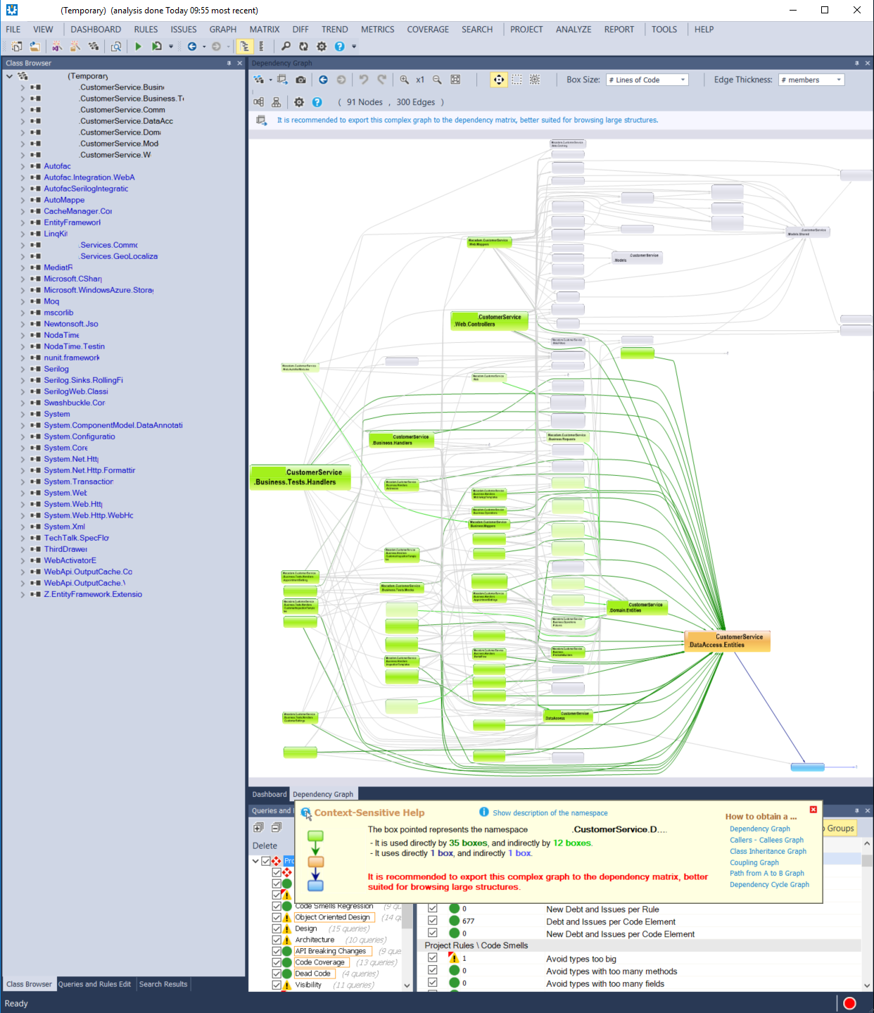
In a larger project, such as the one that was featured heavily in the previous post about the dashboard, I found the View Assemblies and View Namespaces in the Graph menu a little too much information in graph form. It fills the screen with innumerable balloons. There is very little overview. This is convenient when I want to investigate a specific part of an application or when I already know where to start looking.


There is a nice feature to make this more easily consumable. When I right click on a node, I can choose to filter out all non used nodes. This makes the overview a lot more concise, but it sacrifices the overview of all items. Then again, in larger solutions, this makes the graph much more easy to navigate because it removes unnecessary clutter. It does require you to already know where to start looking. In the overview it was easy to spot that DataAccess was used incorrectly, now I'd have to start investigating the central assemblies myself.
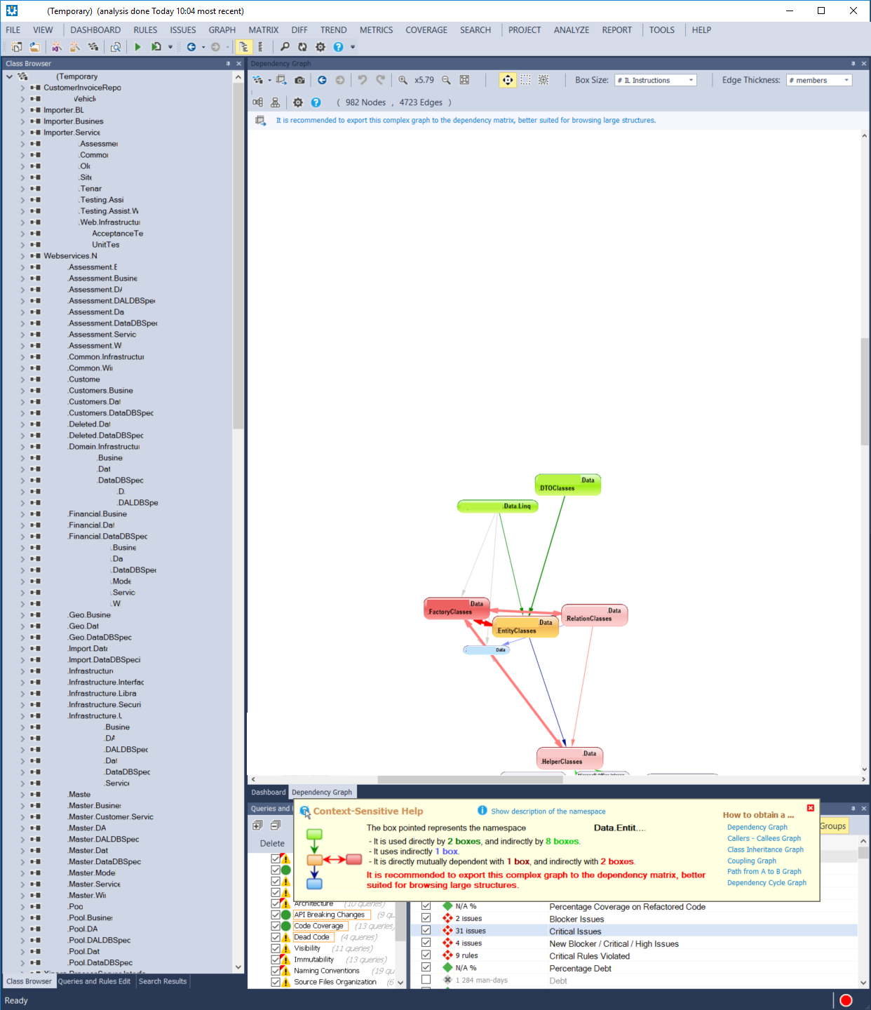
Bonus points for NDepend, in the informational box that pops up, it indicates that large solutions are better investigated via the Dependency Matrix overview. I'll take a look at that in the next blog post.