


Since some time, I've been wanting to use the NDepend tool to analyse the code base I'm currently working on. Then the opportunity presented itself for me to test out NDepend and see how it can help me understand my current code base better.
First, let me be clear on this. NDepend is sponsoring my blog with a one year license for their product. That said, I told them I would be honest about the feedback and posts I would write for them. I loved their reply saying that they value honest feedback and that a pretty post wouldn't help either reputation in the long run. So everything that follows are my own opinions, both good and bad.
Spoiler alert: I was first planning on writing one or two blog posts about the NDepend tool, but ended up preparing 5 posts. That's how impressed I was with their product. So keep reading in the next few weeks for details on the (in my opinion) most important features and what I learned about the code base I'm working on. Now lets get to work.
NDepend is a static code analyser, which looks at a code base, sees how many things are wrong and shows graphs and matrix that display how the code is structured. Or, according to their site:
NDepend is a "Swiss Army Knife" for .NET and .NET Core project teams. With its wide range of features, it gives deep insight into code bases and empowers developers, architects and executives to make intelligent decisions on projects.
After loading a solution into NDepend, which is very fast considering the amount of analysing that is happening, the first screen I see is the Dashboard.
[gallery ids="8871,8876" type="rectangular"]
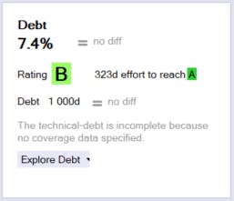
It gives me a nice overview of how good my project is doing. I like that I can see in one glance how well my project is doing because the big, green A or B is immediately visible. The A is from a small, newer project and is what I expected. The B on the other hand is pretty high for a big and almost 15 year old project that is actually not that nice. It also shows that it would need approximately 323 days of work (just 42 days shy of a full year) to receive an A rating. I hate to see how much work a C, D or worse rating would need. Especially when there are 6989 high issues and over 30k on medium issues.
Now the rating is just an overall number which does not concern me all that much. I find it much more impressive that it can show me over 43k issues spread over different rules in more than 522k lines of code. (Which should be an obvious flag that the B rating could be a bit off.) In one of the coming posts, I'll go into detail about the issues and the rules that check them.
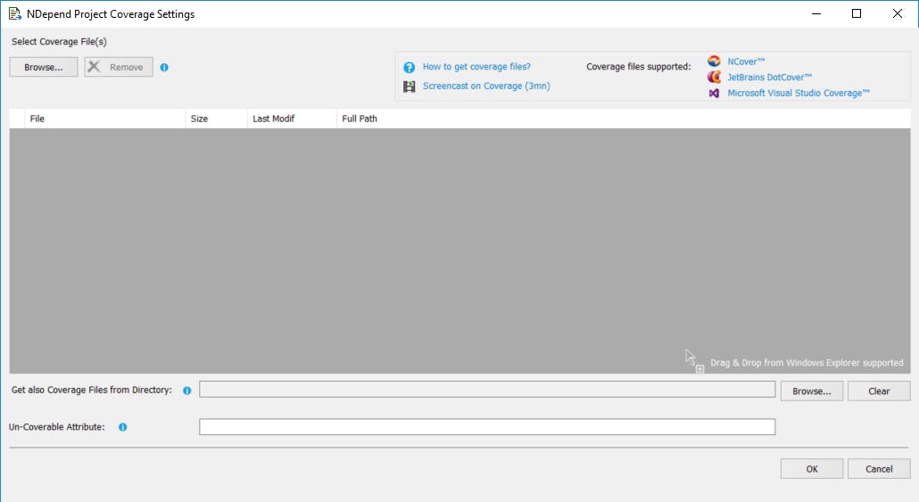
The lines of code and number of types to the left of the dashboard give me an idea how big the solution is. Below the debt box, is room for code coverage results. Results can be imported from 3 big coverage tools: NCover, DotCover and Visual Studio Coverage. I have not experimented with this yet and I'm not sure how much added value this gives me. It does allow me to view all data in one tool, but I prefer specialised tools for specialised jobs. So I'll let NDepend stick to code analysis and I'll let DotCover stick to covering code.
Below these metrics are a number of charts that can track how much the code base improves over time. Since it's the first time I load these solutions into NDepend, I don't see anything yet. I do think that it can be very helpful to follow up with these graphs how the code base is improving (or deteriorating) over time. This can be used as a warning or motivation for the team.
Everything on the dashboard is clickable so I can easily drill down or get help. Now there are two small annoyances here. The first is that the drop down arrow next to the Explore Debt button is half hidden, no matter how wide or small I make the NDepend window. This makes it kind of hard to click.
The second is that there is a popup box that is a fixed size. Sometimes when there is too much text, it doesn't allow me to scroll the text. The only way to scroll is to select the text and move the cursor down.
The dashboard gives me a good indication of the whole program: it displays a lot of very useful information in a very condensed and easily consumable manner, but it can use a little fine tuning. I haven't noticed any rough edges. When NDepend thinks it will take some time to perform additional analysis, it even warns me that the program can become unresponsive and gives me an estimate of how long this can last. Next week, I'll be looking at the graph report and what I learned from it.